If your browser settings have not over-ridden the stylesheet, you may enjoy selecting text and perhaps copying snippets (and discover "black on black" text). Colours are set for reverse video effects. A bit of cursor magic helps you uncover "black on black" text. For some browsers cursor magic = mouse down and drag.
Hand, Eye and Brain: designing for voice, vision and mind
You are invited to think about style and its impact on
cognitive development. You are invited to
- play with your browser settings
- add to this list
- save the text and edit at will
- resize the browser window
- experiment with fonts and colour
- run searches
- use multiple windows to display your experiments
You are invited to set preferences and compare preferences. You are _not_ invited to re-order the list ( I know you did, at least mentally). You are _not_ invited to translate the content (although I suspect regardless of your linguistic competencies, you've begun to explore the semanic field where "play", "add", "save" and "experiment" intersect). You are _not_ invited to run the results of (2) (3) (4) or (5) through voice synthesis software.
You are _not_ invited to ignore the "nots" in the paragraph above. You are invited to not not do what the "nots" tell you not to do.
You are invited to read aloud and repeat the reading aloud at different speeds. But you might be mute ... or a mule or a mute mule.
... to the blind and leaders of the blind (which is to say all leaders). Don't forget that shape can be represented mathematically. Consider a set of vertices for a rectangle
(3,4) (3,8) (7,8) (7,4)
As well, colour can be represented mathematically. Consider the hexidecimal numbers used to code colours in HTML. [For some look-up tables see Lynda Weinman, Designing Web Graphics.]
Math leads to maps. Consider describing a map to the person who cannot see it. [You may enjoy this learning story related by Seymour Papert http://www.papert.com/articles/Twowrongs.html]
Maps lead to translations. Consider a score as a map for moving objects. You will soon (or already) understand that complexity can be described (and built) in a modular fashion from simple elements recombined.
A shape becomes a sound. A colour rings out.
For other browsers enabled with Javascript, a metronome can guide the user's cursor movements. A small animation can appear in its own resizable, relocatable pop-up window or embedded on the page:

The shape of a pointer or a cursor can be modified. Various system utilities have been designed to meet special needs. A search of the World Wide Web tailored to your specific operating system can help you locate more resources. As well multimedia authoring software can exploit some cursor tricks such as trails (perfect for those connect-the-dots exercises). I expect that someday some student of multimedia will produce a browser capable of displaying an HTML document so that text scrolls underneath a merry bouncing ball in sing-along fashion.
Design principles need to address place and time for a pause. This need can take a minimalist inflection. The designer provides the blank, the silence, the invitation to concentrate.
Minimalist approaches tend to avoid a surfeit of eye candy
Less glitz is considered better. Less decoration is equated with less distraction.
In valuing a mimalist aesthetic, designers and instructors can encourage less glitz more gloss. They can invite more commentary and exchange. The idea here is that a pared down presentation style can trigger the imagination. It works for both material presented to learners and material produced by them.
But glitz can lead to more gloss. Very densely informative material may invite exploration and arrest the learner attention. In a high glitz space, saliancy is produced by the observer-participant. Triage is necessary.
Glitz in the sense of high information does not mean reliance on high tech or on platform-specific effects. It does mean reliance on modularity and building complexity out of simple units.
Both glitz and gloss are related to an appreciation of modularity. There is the synthetic orientation: how parts fit into a whole. And breaking a whole into component parts is a function of analysis.
Modular design usually accompanies a desire for portablility. A modular and minimalist aesthetic values the fungibility of the design components. To value fungibility is to plan for the recombination of components. Fungible components can be measured or counted and thus moved. Movement can be a function of navigation. [For example you can change the order of reading Theory III, Theory II, Theory I.]
Learners can reshape material to suit their needs. Some of that reshaping is creating paths, organizing a mental representation of the material.
Activities that improve the appropriate appropriation of material are designed. Well-designed activities are likely to
reiterate learning experiences beyond the boundaries of a
course. The activity produces a take-away. I make the material mine. I author. There is also the take-away of technique: each appropriation, each reworking, invites me to stretch my repertoire for reshaping material that comes my way.
The grace of simplicity adds richness to content. Rich content is enhanced by simplicity.
Michael Polyani describes latent learning as an act of insight preceded by a period of quiet deliberation. But as Polyani's implies in the order in which the elements of his typology are presented, periods of quiet can be prepared by lots of activity, both of observation and participation.
The following is my summary of his three part typology of inarticulate intelligence:
| Trick learning
|
- Motoric learning consits in discovering and practising the proper use of a tool.
- Learner able to contrive an effect by a certain means.
- Skilful action.
|
| Sign learning
|
- Perceptual learning consits in cultivating the expectation of an event by recognizing a sign fortelling the event.
- Learner able to coherently grasp what is perceived.
- General alertness of the senses
|
| Latent learning
|
- Guided by the act of problem-solving, learning shifts from exploration to representation of a situation.
- Learner establishes a fixed interpretative framework of growing complexity
- Drawing inferences
|
Lynn Davie and Christine Frank look at declarative, procedural and
strategic knowledge. They examine online communities as environments that help develop reading, writing and critical thinking.
|
Declarative knowledge |
facts, concepts and vocabulary stored in memory
|
|
Procedural knowledge
|
the intentional use of cognitive tools such as analysis, application,
synthesis, and evaluation
|
| Strategic knowledge
|
knowing how and when to use declarative and procedural knowledge to solve
problems, think critically, and approach novel tasks
|
I want to stress that novel tasks....imaginining other situations... and the role of design..... space to think..... dense clusters and whitespace for the mind... rhythms of complexity and simplicity... I must confess difficulty in fully grasping the distinction between means-end relationships associated by Polyani with trick learning and sign-event relations associated with sign learning. For me, strategically, perception is a kind of doing and thus a means to an end and every event is full of signs waiting to be interpreted. The contingency of the doing/perceiving distinction becomes even more apparent in the case of looping declarative knowledge into procedural knowledge: storing an explanation on how to retrieve what is stored. Part of strategic knowledge is knowing how to make problems. *smile* Part of latent learning is indulging in error generation and its concamitant correction. Or knowing that learning involves a degree of vertigo.
The acquisition of information and ideas is
facilitated by community and multiple perpectives.
Those perspectives range from the bustle of the agora to the quiet of the villa.
Good design can evoke either.
Unpacking a slide is skill which tugs at the intricacies of animation.
Even a still demonstrates a kinetic presence which moves the eye along and drags the brain in tow. Knowing where one wants to go influences the show.
Chongim Choi http://as1.ipfw.edu/99tohe/presentations/choi.htm with a presentation which explores technology, multiculturalism & teaching approaches using art clearly sets a route for the viewer.
I quote from a key slide. The line breaks being indicated by slashes:
" conceptual rationale /// multiculturalism / learning about others // CSILE (computer supported intentional learning environment) / learn with technology // constructivism / learn in the process " This is a list. They are often found in presentations. The list has a heading, "conceptual rationale" and under that heading are their pairs. It is a list that discloses a two column table of terms and definitions. The keywords fall at the end "others // environment // process". All this is acheived by placement and simple mechanism of the line break. And some play with fonts builds some additional word poetry which encapsulates further the interconnectedness of other, environment and process: _about_, _with_, and _in_ are found in italics, a trick easy to reproduce with underscoring. Getting students to translate is like asking them to consider the disappearance of certain markers: fonts, colours, even case and line breaks. it is an invitation to reparse the content. See:
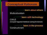
Ask a person to notice the arrows that connect term and defintion (or expansion). Are the like the shoots of a growing plant? Why the upward direction? Guide them to considering right justification and the impact it has on the arrowhead-like alignment of the italicized trio of *about* *with* & *in *. How is the root motif reiterated in the various vertical blocks of colour ?
How do they explain the non-perfect right angle of the middle arrow? Change the metaphor to runways and planes ready themselves to taxi and fly off.
Good design does not just tolerate appropriative metaphors. It becomes the screen for the imagination in action. Across the manipulation of the visual presentation, good design preserves the idea of a space for things to happen. Adequate redundancy is built into the design. There is a degree of overdetermination which entertains the learner's attention on the relations between the elements. Complexity is focussed through modularity.
In this case-specific interpretation of a visual motif, the vertical gradient is not just a ploy to guide the eye. It is also a marker of conceptual territory. The syntagm is strong: a learner even by invoking a reversal is likely to translate this rationale (i.e. process > environment > others) by sandwiching the technology between processes and people. It occupies this place of mediation both visually and conceptually.
The decoration supplements the meaning... layered colours, smartly boxed and offset head element, vertical gradient bringing the eye downwards... Even when all that goes we are left with a primitive layout and even without the layout you are left with the list structure.
If you have access to the appropriate viewing software, you can play more with subtracting design elements and test more of the overdetermination by downloading a copy of the presentation [http://as1.ipfw.edu/99tohe/]. Run the slide show. Observe the variety of animations from frame to frame. From which direction does and element come? Where does it stop? If you have access to authoring software (whether or not it the software that created the resource), you can appreciate the non-use of a master slide as a technique for asking learners to cull design elements to emphasize the look of a key slide in the sequence (for example, the "tab" in the upper right hand could disappear on a key slide). Remember manipulation tests the limits of the concept. Show and tell is powerful for communicating understanding. Soon learners will be engaging themselves in the dialogue of the thought experiment and that counts as placing technology in the mediating position between people and process.
Catharine Reznicek, Distance Learning Specialist with the Shoreline Community College, authored a tutorial for a product-specific classroom suite.
http://elmo.shore.ctc.edu/blackboard/discussionboard/locating_tools.htm#communicationcenter
Like many other good presentations it provides plenty of margin space on both left and right. This helps brings out the centred layout of text and images. The text does not wrap around the images which are screen shots from the classroom suite of software tools. The design invites the reader to scroll and, in a sense, to stroll between words and images. The reader can browse through the the screen shots connected to a given section of the tutorial and either focus on the descriptions and explanations or return (via a link at the bottom of the page) to the table of contents to launch another line of exploration. A similar layout (chunking the tutorial into linked sections) echoes the scroll-and-stroll structure found at the section level. Readers can take advantage of the footer with links to the table of contents or to the next section. The same feature can accommodate those who prefer to work through the material from section to section beginning to end and those that use the feature as a means of flipping through the material to land at the spot that engages their attention. It is important to note that this navigational device does not appear at the top of the document thus forcing a scan of the material through vertical scrolling (either with a mouse or with keyboard [page down] shortcuts.
For some critics such a layout would seem to imitate the best of good print products (using the conventions of bottom of the page). The best of hypertextual critics would describe the layout as providing the appropriate level of direction in its navigational linking (either forwards or back to the table of contents). And the analysts of interactive multimedia would recognize the manual work involved in scrolling as supplementing nicely the cognitive absorption of the material. Quite apart from the technical accomplishment of providing documents that download in an acceptable space of time, the layout engenders a sense of the pause as the attention shifts from section to section or between image and words within a section.,/p>
The design encourages lingering. It does so because it signals that the content is to be absorbed by both a reading of the words and a perusual of the images and a matching of the description with the thing described. The lexical element is strong. Such uncluttered space makes the discrete letter "d" to the right of the images which links to a glossary entry function as a treat for the observant reader willing to roll a cursor near an image or somehow pick up that the lone underlined letter offset from the image is a link. The presence of the "d" also serves as a marker of expected progress as it tends to disappear in the later sections since it is only used upon the first occurrence of the illustrated concept. The reader is cleverly cued to the sequence.
The passage from one sensory modality to another cultivates our powers of abstraction. The cognitive process is enhanced by the engagement of the body. it is that engagement -- the rustling, the coughing, and the looks that transpire in a gathered crowd that provide a measure of concentration/distraction in a lecture or seminar setting. We find similar effects in synchronous and even asynchronous exchanges that are mediated by information technology. We find similar effects with typography and the recording arts. We are attentive to pace and quantity. They supply the affective charge is vital to the learning.
The recording arts of which computer-mediated communication is but the most recent help us parse (and reparse) what is to be learnt. Design provides a space for sequences to ripple, cascade or rush by as a torrent. Electronic design permits us to replay the sensation.
Replaying is but a step into translation.
Hum syllables
Translate the hum into graphic form
Moving away from verbal artefacts, consider humming along with eye movements tracing the outline of an image.
||||||///\\\||||||
|||||| ///\\\ ||||||
|||||| /// \\\ ||||||
|||||| /// \\\ ||||||
|||||| /// \\\ ||||||
The mapping becomes intriguing and whitespace m e a n i n g f u l... One can also consider synchronising the eye (or cursor movement) with an auditory stimulus. Note the auditory stimulus can be a recalled melody (e.g. imagine inviting participants to scroll along or select sections in time to the opening bars of Bethoven's Fifth Symphony [Da, Da, Da, Dahnnn] and to compare results.)
The thought experiment rules. The mere suggestion that students "paint in their minds" or "listen with their eyes" taps into the sublime and the silly. Conceptual artists, they become.
It is the comparative aspect of sensory translation that leads to latent learning and strategic knowledge. Communicating the results of an translation benefits the leap into structural analysis. Recording or remembering the results of one's own solo experimentations reproduces the dialogue of discovery. In either case, group and individual the transformation of exploration into understanding relies on the manipulation of series and their alignment. Intervention (trick learning & procedural knowledge) joins observation (sign learning & declarative knowledge). For further remarks on the relation between powers of abstraction and translations between sensory modalities, see Sorting and Storing (http://www.chass.utoronto.ca/~lachance/S6A.HTM) ...
Contributors were invited to submit a ten- to twenty-line description or summary of the
proposed presentation. I couldn't resist the invitation to number and then relay in "black on black" form in "teal":
1 The grace of simplicity adds richness to content
2 The presentation looks at three resources
3 http://leahi.kcc.hawaii.edu/org/tcon01/papers/frank.html
4 Lynn Davie and Christine Frank look at declarative, procedural and
strategic knowledge
5 http://elmo.shore.ctc.edu/blackboard/discussionboard/
6 CathyR's illustrated tutorial introduces a software product and
7 stesses that threads can show structure of conversation
8 http://as1.ipfw.edu/99tohe/presentations/choi.htm -- a fine set of
slides
9 Chongim Choi explores technology, multiculturalism & teaching
approaches using art
0
9 These are places to begin thinking about style and its impact on
cognitive development
8 Design principles need to address place and time for a pause
7 The blank, the silence, the invitation to concentrate ...
6 In valuing awerness of low tech approaches
5 designers and instructors can encourage less glitz more gloss
4 less glitz -- avoid a surfeit of eye candy
3 more gloss -- more commentary and exchange
2 and appropriate appropriation of material
1 and the reiteration of learning experiences beyond the boundaries of a
course
0 Rich content is enhanced by graceful simplicity